Snowflake Releases New Geospatial Innovations, Now with CARTO Workflows Integration

Snowflake is continuing its strong momentum and investments in geospatial analytics with a package of new features, plus integration with a novel pipeline authoring tool from CARTO. Snowflake users can now benefit from better handling of non-compliant spatial objects during ingestion, and a package of functions for performing orientation transformations—all available in public preview. Let’s take a closer look!
Invalid shape handling
Many Snowflake customers have been eagerly awaiting support for spatial objects that are not compliant with OGC standards. It seems everyone has a handful of such shapes in their raw data, and in the past they had to fix those shapes outside of Snowflake before ingesting them. Now, you can load and store these invalid shapes in our GEOGRAPHY and GEOMETRY columns, and either fix them after the import or keep using them as they are. Additionally, we added a new function, ST_ISVALID, to verify whether a shape is valid.
Spike and Self-Intersection are two examples of invalid shapes that can now be imported into Snowflake:

New orientation and transformation functions
Snowflake’s new function set is designed to streamline the process of performing orientation transformations.
ST_SIMPLIFY takes complex shapes and “smoothes” them by reducing the number of points needed to represent those shapes. Very useful for reducing the size of objects.
ST_BUFFER creates a new shape that goes around an existing shape, like a protective bubble. See below for an example of a five-meter-wide buffer around a city power grid. No more cut lines!

ST_AZIMUTH calculates an angle between the line segment formed by the two points and the north direction on the map. It is a useful function for calculating direction between two points on the earth’s surface.
ST_MAKEPOLYGONORIENTED creates a polygon using a series of connected lines and ensures that a shape or a polygon is facing the right direction. This is a critical item when working with polygons or shapes, as it’s important to know which side is the “inside” and which is the “outside” of the shape.
Introducing CARTO Workflows
Snowflake’s powerful data ingestion and transformation features help many data engineers and analysts who prefer SQL. However, as Snowflake is being used more often by generalist business analysts and data scientists who don’t have deep geospatial knowledge, analysts are looking for new tooling that is visual, easy to use, and enables them to rapidly gain insights from location-based data. This is where CARTO’s new Workflows tool comes in handy.
CARTO Workflows is a no-code analytics tool that allows analysts at all skill levels to perform complex geospatial analysis using a simple visual interface, without requiring a background in Spatial SQL.

Workflows is integrated with Snowflake, so users can design, execute, and automate hundreds of analysis components and push these queries to the Snowflake platform. The visual interface is designed to be highly intuitive. The Flow Diagram tool provides a wide range of analytical and data processing components, including various data sources and sinks, spatial joins and filters, clustering, isoline creation, and tools to leverage spatial indexes like H3 and Quadbin.
Workflows automates not only geospatial processes, but other data workflows as well. Processes can be semi-automated, relieving the burden of regular analysis workflows, and you can even trigger notifications based on the output of your analysis. Because Workflows is fully integrated into the CARTO platform, the output of your workflows can be visualized in the Builder tool and shared across teams as interactive dashboards or embedded in your own spatial apps.
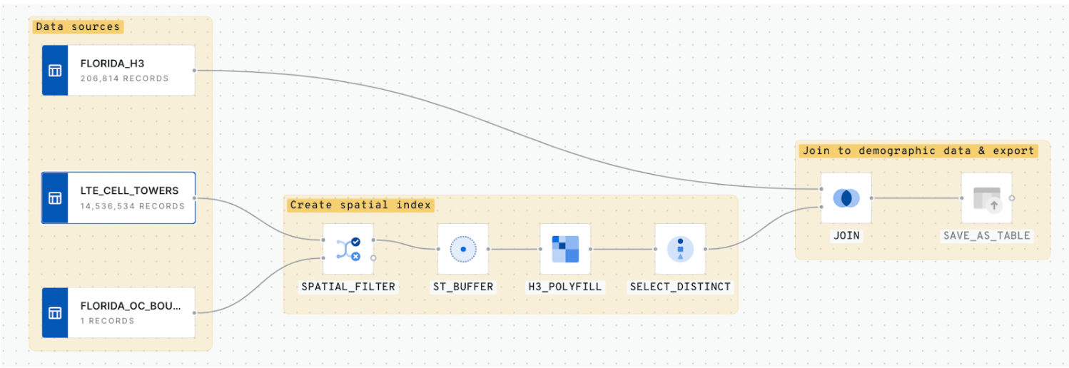
Let’s take a look at how CARTO Workflows can be used by a telco customer. In this demo video, we perform a geospatial analysis common to the telco industry to determine ideal locations for network infrastructure. Here are the steps:
- Add data on existing LTE towers, based on this OpenCelliD data set from Snowflake Marketplace.
- Filter tower information to only those that intersect Orange County, Florida.
- Create 500m buffers around each tower.
- Polyfill these buffers using the H3 Spatial Index.
- Join H3 cells to population data from the CARTO Spatial Features data set.
- Export the resulting field to be able to develop a map visualization and analyze the population living within the coverage area of each LTE tower.
- Use this visualization to determine the optimal tower locations to prioritize network coverage infrastructure investments.
Making geospatial insights available to a broader audience
With this bundle of product updates and partner tools, Snowflake addresses the needs of both expert developers and generalist analysts. Our new functions help analysts who prefer to do their data exploration in SQL, and CARTO Workflows are democratizing cloud-native spatial analytics and empowering more users to benefit from the insights that can be found in geospatial data and analytics. Learn more about Snowflake’s geospatial functions, or try out CARTO Workflows with a free 14-day trial.

