The Advanced Guide to Unlocking Geospatial Insights in Snowflake

Over the last three geospatial-centric blog posts, we’ve covered the basics of what geospatial data is, how it works in the broader world of data and how it specifically works in Snowflake based on our native support for GEOGRAPHY, GEOMETRY and H3. Those articles are great for dipping your toe in, getting a feel for the water and maybe even wading into the shallow end of the pool. But there is so much more you can do with geospatial data in your Snowflake account! We get it, though — it can be tough to jump from “I now understand the concepts” to “How can I tackle my first use cases?”
The world of geospatial data processing is vast and complex, and we’re here to simplify it for you. That’s why we created a Snowflake quickstart that walks you through various examples of geospatial capabilities within real-world contexts. While these examples use representative data from either Snowflake Marketplace or data we’ve made freely available to you on Amazon S3, they can be applied to your Snowflake account, data and use cases to deliver valuable insights to your user community. This blog post discusses how to do that, but refer to the quickstart itself if you want to see the actual code.
Transforming location data into geospatial data types
But let’s start with a quick recap: Location data is everywhere. Just like your Snowflake account almost certainly has time-based data, your Snowflake account almost certainly has location-based data as well, as most transactional data contains some element of who, what, when and where.
In its simplest form, location data is generally known as a variety of text and numeric fields that comprise what we call “addresses” and include things such as streets, cities, states, counties, ZIP codes and countries. Humans can read and understand these strings fairly easily, but in their text form, they are largely informational values that we look up when we need to know them and nothing more. Sometimes, these text fields can also be accompanied by latitude and longitude fields. These fields are great because now we can do more with the location data — we can place it on the Earth as a point. This is useful because we can integrate all such points into a BI tool’s mapping capability to show which country or territory the point belongs to, or we can integrate these points into a spatial grid such as H3. While various Snowflake BI partners support working with latitude and longitude data, Snowflake has built-in support to transform your longitude and latitude data into an H3 spatial grid for fast computation and visualization (as we’ll see later).
But we can go a step further and transform that latitude and longitude data into a GEOGRAPHY or GEOMETRY data type. We can use the former when we need an ellipsoid “globe” representation of the Earth, and the latter when we need a planar “map” representation of a more localized location. And we can construct these data types with a variety of functions.
Now, that may not sound like much, but with these two data types we can start constructing a series of points into a line, connect multiple lines into a polygon and represent complex locations as a series of lines and polygons. We can perform complex calculations and relationship associations between objects of these types and start to unlock insights we didn’t know were available to us with a simple “address” field alone. You may ask, “But what if all I have is the textual address field?” Ahh, welcome, fair traveler, to our first swashbuckling adventure: geocoding. “Geo-what-ing??”
Geocoding and reverse geocoding
Geocoding is the act of taking your textual address data and transforming it into a geospatial type to unlock other use cases you wouldn’t otherwise have been able to deliver. And of course, it’s also possible to go the other direction — turn your less readable geospatial data type into a more human-readable set of location fields. Both of these transformations can be done with specialized Snowflake partners such as Mapbox and TravelTime, which are both Snowflake Native Apps available via Snowflake Marketplace. We recommend these providers for the most accurate geocoding and reverse geocoding. But sometimes, you need to balance accuracy with cost or you need to demonstrate ROI before you can spend money — so let’s talk about how you can get started with geocoding and reverse geocoding directly in Snowflake.
In this use case, we will use two data sets from Snowflake Marketplace: Worldwide Address Data, a free and open global address data collection, and a tutorial data set from our partner CARTO, which has a restaurant table with a single street_address column. If you were to follow this example for your data, you would replace the tutorial restaurant table with your table. You’ll do some data prep on these two tables, which you can see in the quickstart.
The DIY Snowflake geocoding involves three steps:
1. Use an LLM to transform a complete address string into a JSON array with its parts as attributes. You’ll make use of the SNOWFLAKE.CORTEX.COMPLETE function in this step, which uses a Snowflake-hosted Mixtral-8x7B model to do the conversion using a detailed set of instructions you provide as part of the functional call. See the quickstart notes for choosing the proper warehouse size to run this at scale.
2. Create a simple geospatial column on the latitude and longitude in Worldwide Address Data.
- ST_POINT is used to create the geospatial column from the latitude and longitude.
- Unnecessary data is removed from the Worldwide Address Data table based on invalid latitude and longitude values.
3. Use JAROWINKLER_SIMILARITY to match addresses. You’ll join the two tables together on a few columns, wrapping the street name column in a JAROWINKLER_SIMILARITY function, because it’s not uncommon for street names to have subtle string differences between sources, hence the “95” as our similarity threshold in the function call.
It’s important to note here that this method isn’t flawless in accuracy. The quickstart shows in more detail the level of accuracy achieved and some of the reasons why this method is imperfect, but it’s important to note the cost difference between this method versus a dedicated geocoding service. This method is a great way to achieve simpler requirements or prototype the justification for more dedicated geocoding services with more complicated requirements.
To do reverse geocoding, or produce an address from a geospatial data type, we’re going to build a stored procedure that does three things: creates a results table, selects rows that haven’t been processed and finds the closest address match using a loop with an increasing radius search until a result is found. You can call this procedure like all procedures in Snowflake, passing in the appropriate arguments as defined at the top of the procedure code, which you can see in the quickstart.
Geocoding your address data unlocks more potential to use that address data in more insightful ways. Let’s dig into one way that you can use that geocoded data.
Forecasting using geospatial data
Forecasting is a common activity with time-series data, as there are sound ML models designed to input historical data and predict a window of future data based on historical trends. Snowflake includes a built-in ML forecast model called SNOWFLAKE.ML.FORECAST that you can easily use for this activity. While you can do time-series forecasting across any time-based data, enriching that forecasting with location data provides another value dimension in the forecasting process.
There are two data sets used in the quickstart: New York City taxi ride data provided by CARTO and event data provided by PredictHQ. You can think of the two data sets like this: The taxi ride data is like any time-series-based data you have about something that happens at a certain time and place. You likely have that kind of data in your organization. The event data adds more context to a time-based element in your data. In this example, the event data may inform any increase or decrease in expected taxi rides in New York City. Other types of contextual data you may have include open or closed periods, recurring promotional periods, public events and more. Whatever it is, contextual data can help provide more accuracy to a forecast by enhancing any given day/time with an increasing or decreasing expectation.
The forecasting activity involves four steps:
1. Use a spatial grid to calculate a time series of taxi pickups for each cell in the grid.
You’ll use the H3 spatial grid to divide New York City into cells based on the pickup location.
You can pinpoint a pickup within a cell by taking the latitude and longitude and converting that to an H3 cell.
You can then aggregate the number of pickups within each New York City cell by hours of the day using Snowflake’s TIME_SLICE and H3_POINT_TO_CELL_STRING functions.
Lastly, you’ll need to “fill” in any hour gaps in a location with 0 (zero) pickup records. This is necessary for time-series forecasting.
2. Enrich the hourly time-series data with event data.
This adds “feature” columns to the above data by flagging each row as either a school holiday, public holiday or sporting event based on joining our event data.
Note that you can add whatever “features” make sense for your event data. School holidays, public holidays and sporting events are just realistic examples for this scenario.
3. Build a model, a training data set and a prediction data set.
The SNOWFLAKE.ML.FORECAST model requires a training step before making predictions, so your data from Step 2 needs to be divided into two tables by time: one for training and one for prediction.
From there you’ll create a model, with one of the inputs being the training data table you established above. You’ll also identify key columns, like the time column, the metric to forecast and, in this instance, what location data you want to forecast by.
4. Run the model and visualize the accuracy of the predictions.
Once the model has been trained, it can be called, pointing to another data set to use for prediction.
The prediction can be output to a table and then compared to the actuals to assess accuracy. There are several ways to do this, but the quickstart suggests using a symmetric mean absolute percentage error (SMAPE).
The chart below shows what the output of this comparison can look like for one H3 cell, with the forecast model having a pretty strong accuracy rate:
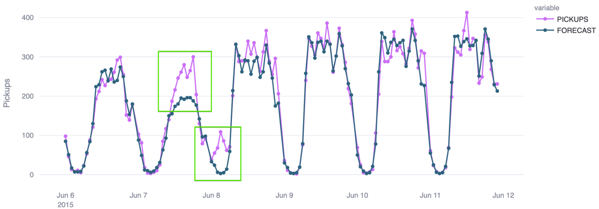
Time-series forecasting in Snowflake can be a powerful tool, and it can be augmented further by your ability to group locations into a given cell in a spatial grid and forecast that cell, rather than trying to forecast each location individually, which is too granular.
Use H3 to visualize sentiment by location
You used an LLM in the geocoding example above to help you transform data into a different format, but you can also use it to score textual data based on the positivity or negativity of the language used in the text. This is valuable to assess the sentiment of people in a given situation, whether that be feedback they provide on products or services or how favorably they view your brand. The key here is that you can turn raw text into an ordinal measurement and then analyze whether location factors into that measurement. Let’s look at how we can do this in Snowflake.
From a data perspective, there are three key things you need to have:
An event or transaction of some sort
Raw text commentary on that event
The location of that event
This could be all be in one system (for example, customers place an order in an app and then provide commentary on their level of satisfaction with the ordering process), or it could be in different systems (for example, a customer places an order for a product but then posts on social media about how much they liked the product they received). The quickstart uses synthetic delivery data, which includes customer feedback on how the delivery experience went.
Visualizing this feedback by location involves two steps:
1. Score the sentiment of the feedback for each delivery.
First you’ll use SNOWFLAKE.CORTEXT.COMPLETE like before, but this time the instruction you’re giving the LLM is to evaluate the text and assign it a textual category label, such as “Very Positive.”
Then you’ll convert those textual category labels into numbers that you can aggregate across a number of deliveries in a common area.
2. Visualize the aggregate sentiment by location using H3.
Instead of precomputing the location scores like we did in the time-series forecasting, we’ll build an app that will aggregate sentiment scores into H3 cells on the fly.
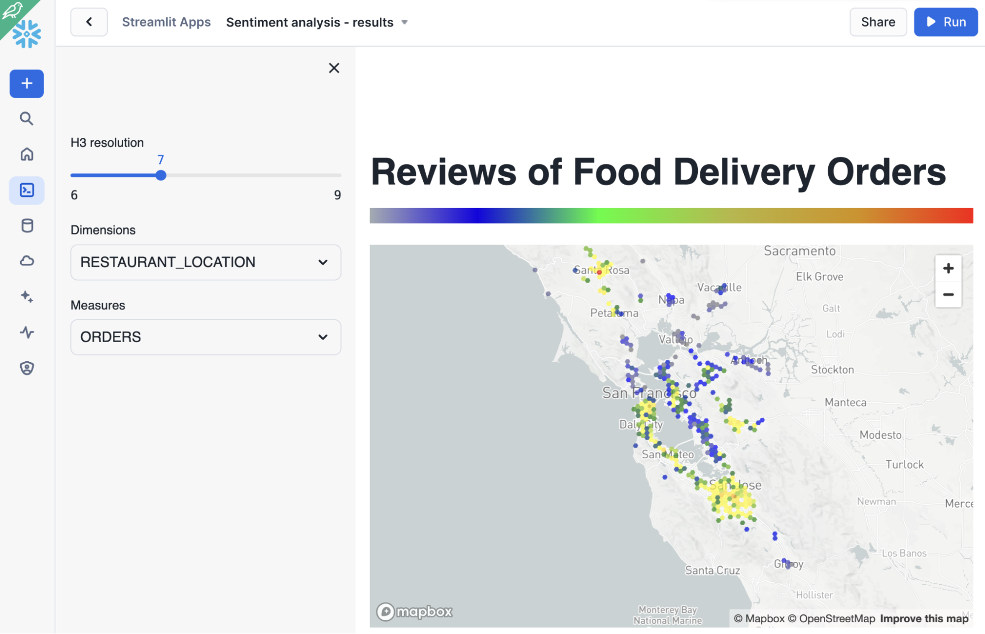
The Streamlit app will use ST.PYDECK_CHART to plot and colorize the H3 cells based on sentiment quantiles.
Here is an example of visualizing sentiment analysis by store location:
But more importantly, the app allows you to explore the data more freely because we are calculating everything on the fly. How does that work? Consider this zoom-in below:
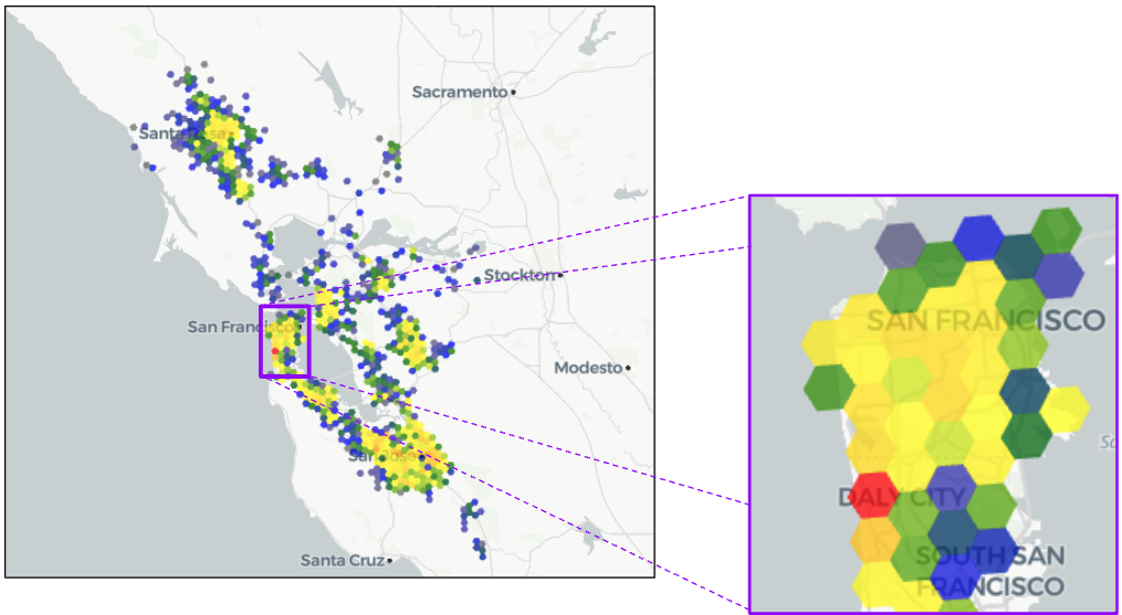
What if we want to get a more fine-grained view of the San Francisco peninsula? Using the slider in the app to change the H3 resolution from 7 to 8 gives us a clearer picture:
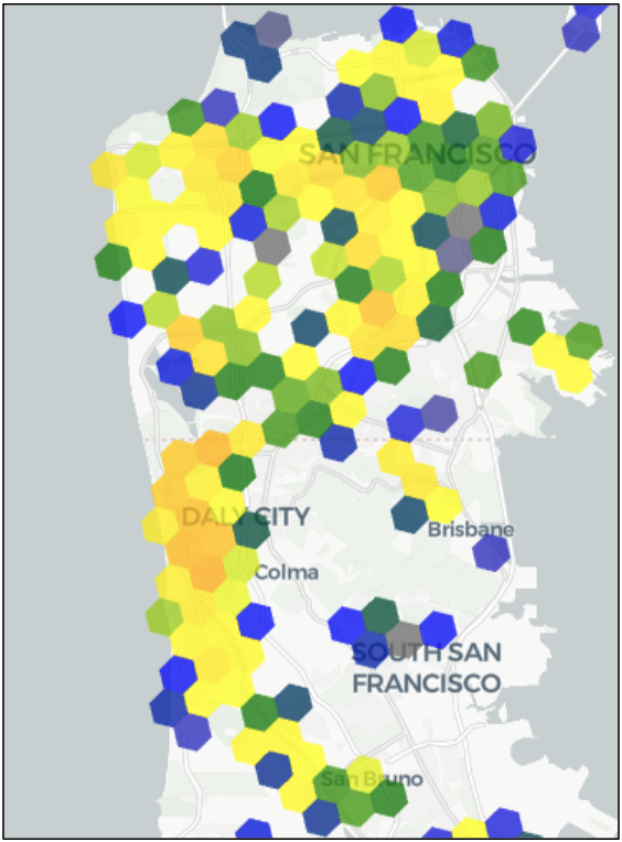
Now we can see more clearly where there are gaps, areas of strength and areas of concern. This on-the-fly ability to get more location resolution is like going from an SD TV to an HD TV to a 4K TV to an 8K TV — a sharper picture of what we’re trying to look at.
H3 is a powerful and fast way to get location clarity on metrics. And by combining it with an LLM, we can turn nonadditive text into a measurable output. This is an extremely powerful capability, and you can apply it in many different ways within your organization!
Nearest neighbor analysis with raster and shapefiles
While many companies get their location data from standard data sources that the rest of their data also comes from, those who work deeply in geospatial data know that data can also come from specialized formats and files. For the uninitiated, the quick overview is that most of the geospatial data covered in this and other blog posts so far is vector data — points, lines and polygons. A common format used to store vector data in a file is a shapefile, but shapefiles generally are opened with dedicated GIS applications, not read by databases. Raster data differs from vector data in that the data is represented as a grid of cells — think of a pixelated image. Raster data is commonly stored in GeoTIFF files, which are, again, not typically read by databases. Vector and raster each have their use cases, and sometimes you need to access both; the quickstart tackles that head-on.
In this scenario, we will leverage two data sources — an elevation map stored as a raster GeoTIFF and temperature/precipitation data stored in a shapefile — to use both data sets to predict the presence of groundwater. But really, these are just representative files to showcase how we can access these types of files in Snowflake and ultimately use them in a specific analysis. If you have GeoTIFF or shapefiles in your organization, you can use these methods to get their data into Snowflake.
Combining these two data sources together to do a nearest-neighbor analysis involves three steps:
1. Load the GeoTIFF file.
You’ll use the Rasterio Python library to create functions that extract the GeoTIFF metadata, evaluate the bands present in the GeoTIFF and ultimately read and convert the centroid of each pixel into vector data (points).
Then evaluate the metadata and convert the points to a data type in the proper SRID.
Last, you’ll reduce the voluminous number of pixels into a more manageable size by converting the points to H3 cells.
2. Load the shapefile.
You’ll use the Fiona Python library and Snowflake’s Dynamic File Access capability to build functions that read the shapefile metadata and data.
From there you’ll evaluate the nature of the shapefile data and how it’s represented so you can design a query to load it into a table with the proper columns and data types.
Similar to Step 1, you’ll reduce the number of rows to a more manageable size by converting the points to H3 cells.
The quickstart also shows an alternative way to visualize this data, but that is an optional step.
3. Calculate the nearest weather point for each elevation point, using one of two methods outlined by the quickstart.
Note: Each method involves filtering both tables down to the area of focus, as detailed in the quickstart.
The first method is self-contained within Snowflake and has you use a query that combines ST_DWITHIN and a QUALIFY window function. However, this method can be compute intensive.
The second method involves using the SedonaSnow Snowflake Native App, which gives you access to the ST_VORONOIPOLYGONS function. Voronoi polygons can be a more efficient way to group points closest to another point, but to gain access to such a function, you’ll need to install the SedonaSnow app.
It’s not uncommon in the world of geospatial data to need to access data from nontraditional files. Fortunately, the flexibility of Snowflake allows you to work with these files and still access this valuable data for your analyses.
Interactive maps
It’s also common in the world of GIS to interact with user interfaces designed for location data. These applications go beyond what’s typically possible in a BI tool to present more data with sophisticated layer capabilities and other location-specific interactions. One open source tool is called Kepler.gl. But instead of having to implement Kepler.gl yourself, you can simply install Dekart from Snowflake Marketplace and have immediate access to Kepler.gl and its more advanced location visualization features. Running Kepler.gl in a Snowflake Native App using Snowpark Container Services also ensures that your data never leaves Snowflake. Let’s see an example from the quickstart.
In this use case, we will build an interactive map to view the density of EV charging stations, which will identify areas where it might be worthwhile to add more stations. This example requires you to layer three sets of data: country boundaries, transportation routes and locations (EV chargers in this example), but you could easily substitute the transportation routes and EV charger locations with two other sets of location data in your organization. After you follow the setup in the quickstart, you’ll do the following three things.
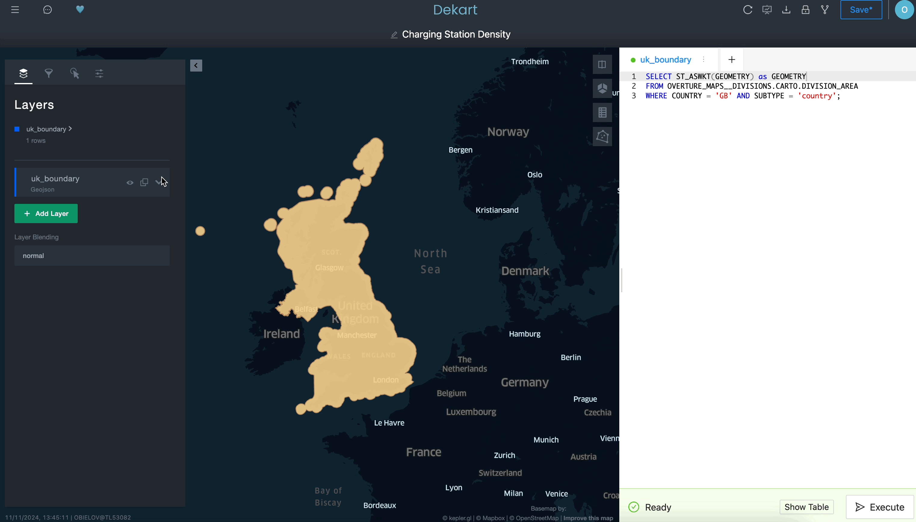
Use a query to define a boundary layer:
Use a second query to grab the transportation routes as a second layer:
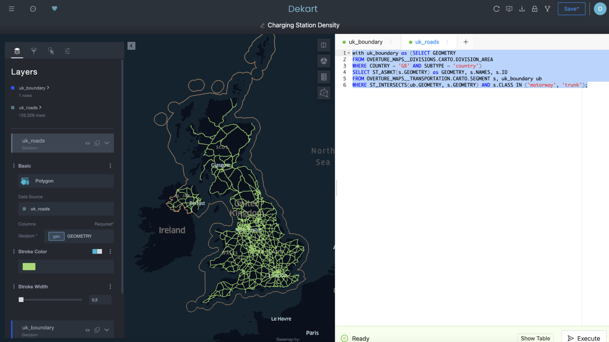
Notice above how “uk_roads” was added as a layer on the left-hand side of the Kepler.gl UI.
And then use a third query to plot the EV charging stations as yet another layer:
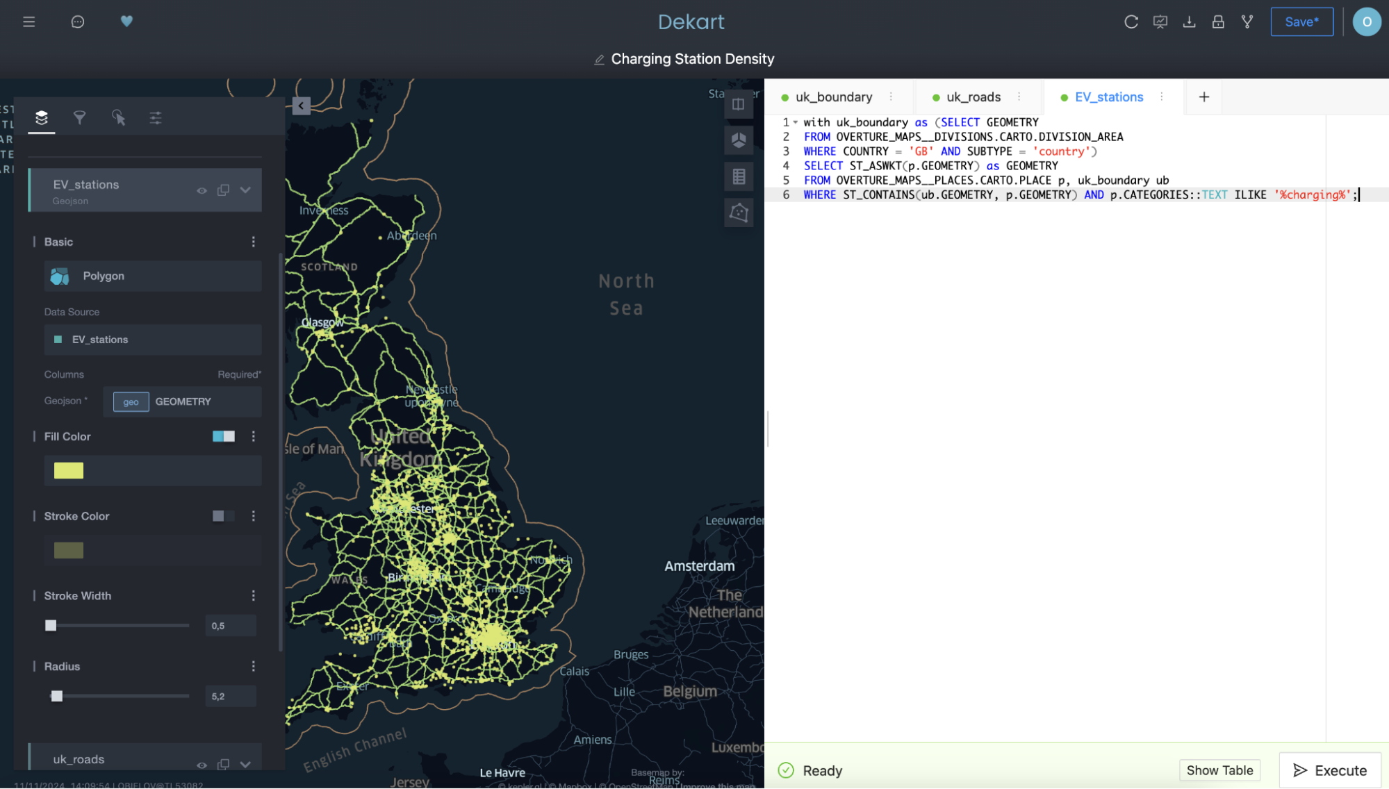
Notice in the second and third queries how you’re referencing the query for the first layer by name in the FROM clause as a means to filter the second and third queries by selecting only the roads and chargers contained within the boundary of the first layer.
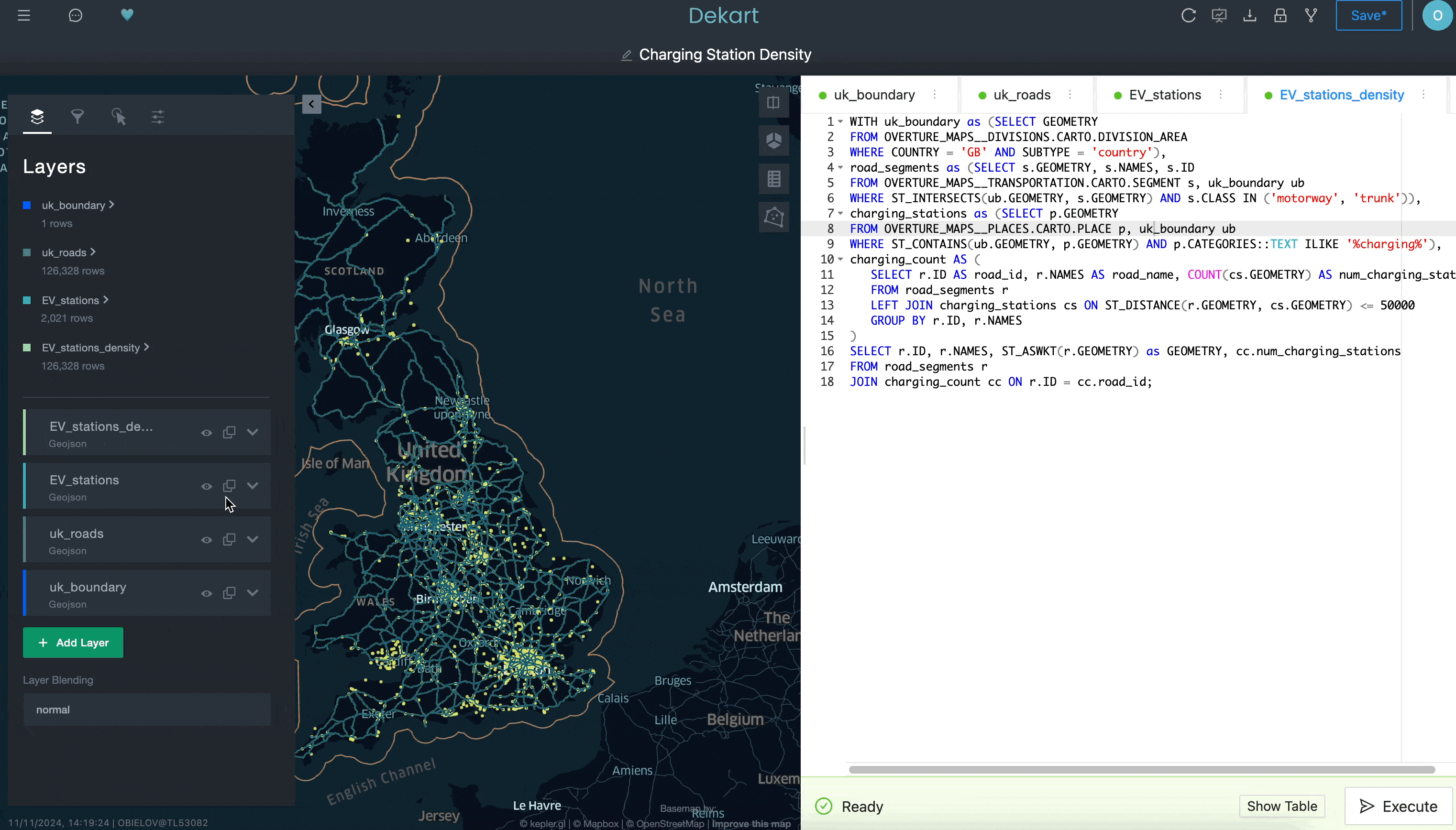
Last, you can add a fourth query that will calculate the density of the EV charger locations by counting the number of EV chargers within a 50-kilometer radius for each road segment:
While we’re not showing everything you can do with Kepler.gl in this example, hopefully it does illustrate how you may have a hard time doing this in a traditional BI tool. By having access to a more sophisticated interface for creating location visualizations — and having that easily installable from Snowflake Marketplace — you can advance your location analysis capabilities in ways that are easier than you realize.
Conclusion
In this blog post, we talked about the various ways you can derive insights from geospatial data in Snowflake. We covered six main capabilities, which allow you to:
Turn location data into GEOMETRY and GEOGRAPHY data types to enable further analysis and open up use cases, such as geocoding and reverse geocoding
Enrich with time-based and event data sets
Apply machine learning models and native machine learning SQL functions for forecasting on geospatial data
Apply LLMs for sentiment analysis based on locations
Also calculate distances and conduct near-neighbor analysis with native functions
Visualize interactive maps by extending Snowflake’s native capabilities with Snowpark Container Services and our expansive ecosystem of partners
Follow this quickstart to get hands-on experience with these scenarios. It will help you learn how to apply these more sophisticated use cases and get more value from your location data in Snowflake. May you find the points you’re looking for!
Author
